0 to 1 · Enterprise SaaS · Health Insurance
Designing security & access governance for Ginja.ai
Health insurers on Ginja.ai couldn't see, control, or change who had access to their own platform. Every change went through Ginja's support team. I designed the system that transferred that control to them: roles, permissions, user lifecycle, time-bound access, and hard denials. Built for an industry where one wrong checkbox is a compliance breach.
Role
Product Designer
Enterprise Client
Old Mutual Limited
Platform
B2B Enterprise SaaS
Team
1 PM, 1 Front End, 1 Backend Engineer and me
0 to 1 · Enterprise SaaS · Health Insurance
Designing Access Governance for Ginja.ai
Health insurers on Ginja.ai couldn't see, control, or change who had access to their own platform. Every change went through Ginja's support team. I designed the system that transferred that control to them: roles, permissions, user lifecycle, time-bound access, and hard denials.
Role
Product Designer
Enterprise Client
Old Mutual Limited
Platform
B2B Enterprise SaaS
Team
1 PM, 1 Front End, 1 Backend Engineer and me
Resume

1 · The Industry Context
Setting Context
Ginja.ai is a SaaS platform for health insurance companies and service providers. Organisations that sit at the center of one of the most regulated data ecosystems in the world: policyholders, hospitals, third-party administrators, underwriters, and national compliance bodies.

The platform shipped with a handful of pre-configured roles — Underwriter, Sales Person, a few others. That was it. The insurance companies using Ginja.ai had:
No visibility into what those roles actually granted
No control to customise, restrict, or expand access
No way to manage their own users — every new hire, exit, or role change went back to Ginja's support team
No accountability — if something went wrong, no record of who did what, when


The brief, before any research was- “How might we build a role and permission management system for health insurance organisations?”
Our first enterprise user, Old Mutual is one of Africa’s largest financial services groups insurance, banking, wealth management, and underwriting, spread across 14+ countries. For this case study, we use Old Mutual as the lens through which the problem is best understood.
14+
Countries of
operation
12K+
Hospitals in
network
4.5M+
Members covered
$3B
Group revenue
These figures describe the scale of one of the user we were designing for.
Not Ginja.ai’s product impact.
2 · Complexity
Undertsanding Complexity
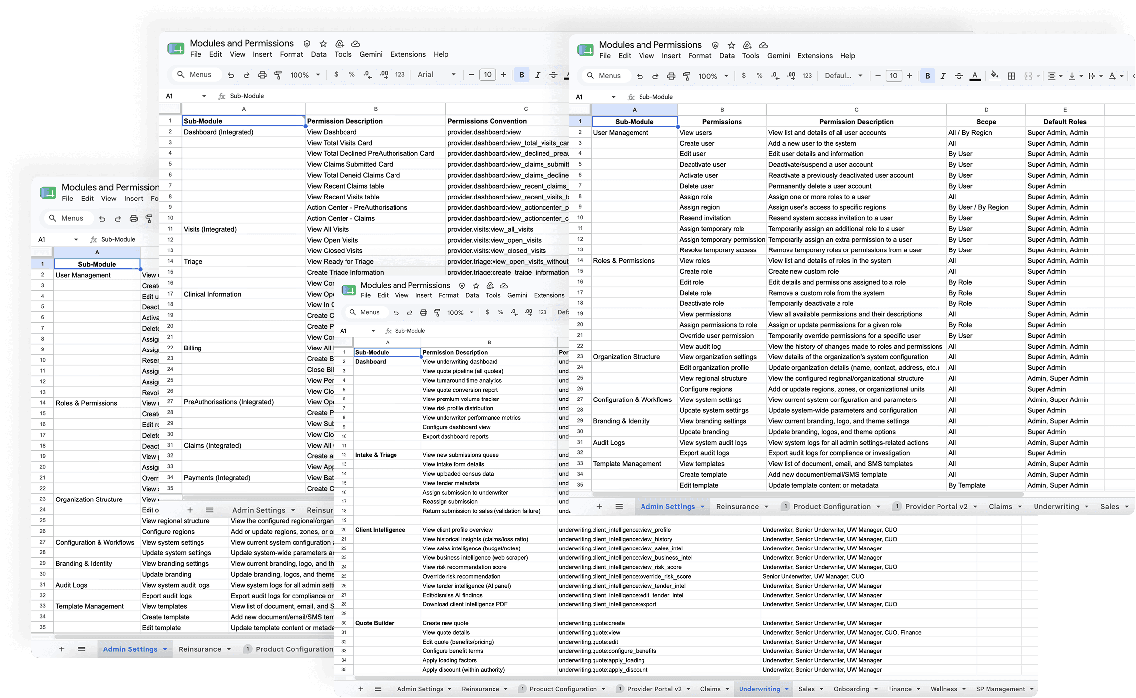
Before defining a single role, we mapped individual permissions spanning underwriting, claims, payments, provider networks, and product configuration
The Underwriting module alone contained over 300 permissions and sub-permissions. Each one a potential access control decision.
This scale alone ruled out simple solutions. A flat list of 300+ checkboxes per module, multiplied across every department, in every country, was never going to work.
Why standard access models don’t
work here
To anchor our architecture, we ran a gap analysis against industry standards. Most modern software manages access using CRM or helpdesk paradigms — tools like Freshdesk, HubSpot, or Salesforce. These systems are built on an assumption of trust by default. In regulated health insurance, that assumption breaks completely

An underwriter viewing unauthorized medical histories, or a claims manager seeing
unapproved financial ledgers, isn’t a “bad UX moment.” It’s a regulatory failure and a
breach of institutional trust.

3· Three Layer Access Control
The Architectural Structure
Standard systems bundle role, permission, and context into a single object producing roles like "Claims Manager- Kenya" and "Claims Manager- Rwanda" as two entirely separate configurations. At Old Mutual's scale: 14 countries × multiple access tiers × every department - that's hundreds of near-identical roles, impossible to maintain and dangerous to audit.

We separated the model into three independent layers: Role - Claims Manager. One definition, reused everywhere. Permission- view, approve, modify claims. The same token set everywhere. Scope- the conditions under which the permission applies: an amount limit, a provider tier, a department boundary, a region.
We stopped thinking about scope as "where you work" and started thinking about it as "under what conditions your permissions apply."

A Claims Manager in Kenya and one in Rwanda now share the exact same role and permission tokens; their local compliance and financial boundaries are isolated entirely by scope rules. Hundreds of fragmented configurations collapse into a single matrix.
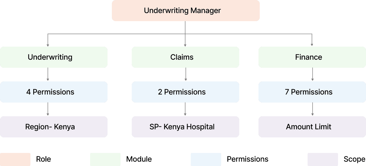
The model also survives reality: an Underwriting Manager doesn't live in one module. They touch Underwriting, Claims for risk review, Finance for premium oversight - the same role fans out into independent permission sets, each constrained by its own scope condition. Nothing duplicated. Nothing hardcoded per country
4· One Layer, Four Instruments
The 4 Systems
The architecture answers how access is modelled. The interface had to answer four operational questions. The same four gaps admins named in research. Each became a subsystem.
Role Management
Creating a role without drowning
in 300 checkboxes
Our first prototype- a step-by-step departmental funnel failed low-fidelity testing fast: too many steps, a flat unmanageable permission list, no success feedback, duplicate role names with no warning.
The structural fix was a split-pane system:
Modules as rows (Reinsurance, Underwriting, Sales…) admins think in their own domain, not in access theory
One consistent column pattern - Access → Modify → Configure across every module. Predictability is what reduces cognitive load at scale
Scope as a separate step - configure permissions first, then add conditional scope. Two mental models, two distinct steps
For setting scope for various permissions I explored drop downs. Depending on the permission selected, only the relevant scopes would be active to select from. I refined it further and removed the inactive scope permissions. Used progressive disclosure. As user selected certain options, relevant conditions appeared.
The Role Creation form breakdown
The Modules were aligned on the left side like chapter names and the contents within- the sub-permissions would appear on the entire screen in the centre for users to configure roles from. The modules would remain sticky to the left and the permissions would scroll and reveal more contents.
Each permission was divided in 3 permission types- access, modify and configure. All permission types, weather it was to view, edit, deactive , create, delete, approve, deny, accept, reject and many other types of permissions could easily come under these three types.
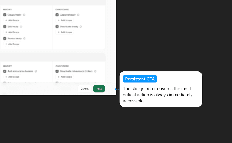
The CTA would also remain visible at all times to save a role, even when the user is browsing through hundreds of permissions.


Demo Video of Role Creation
A snippet for the happy path of role creation.
Design Decision
While working on the final UI, I had to take several design decisions along the way to best suit both the user, the business. Here's an example of one of them:


The decision- Inbuilt Scope Card
As a designer, the Floating Card feels cleaner, it protects the grid. But viewed through the lens of a security administrator, in health insurance compliance, context outweighs aesthetics.
The layout shift caused by the Inbuilt Card is a genuine UX trade-off. It’s also a necessary sacrifice. An administrator configuring a financial threshold cannot afford visual blind spots. The Inbuilt Card preserves complete peripheral vision of a user’s total access profile, preventing the exact type of overlapping privilege error this entire system exists to solve.
The Real Job: Handling edge cases
and error states
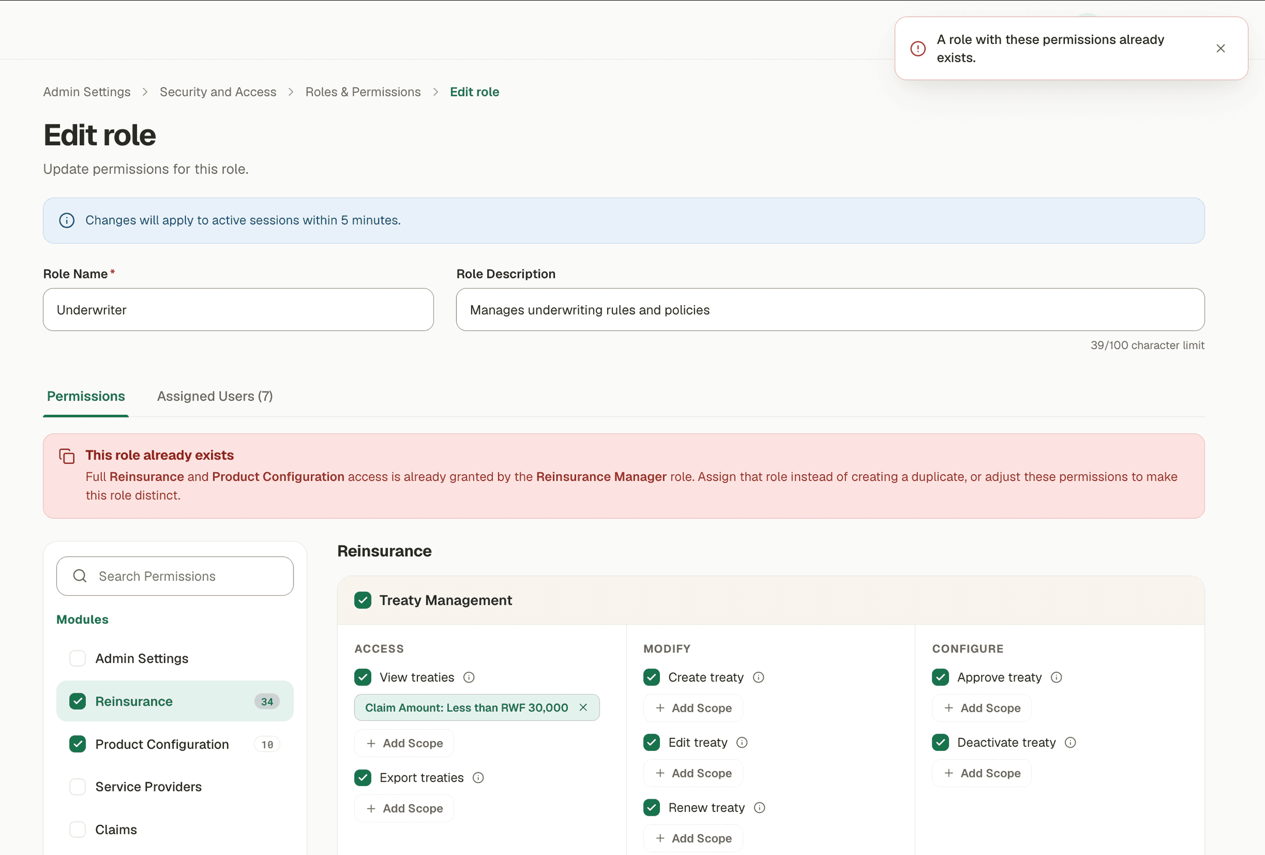
Working on the UI and the happy path was the easier task. Figuring out the places a user can get stuck. The places user needs to be warned and the system defined roles- that they cannot edit/ configure or delete, was the most important task for the product to work in real environments, where errors happen all the time.


User Management
The user lifecycle, without the
support inbox
Creating a user means three simultaneous assignments: identity, role(s), and organisational scope — which region(s) of the company's own configured structure this person belongs to. The system validates assignments against that structure, so an admin in Kenya can't quietly grant someone access in Rwanda.
While assigning roles to users means we had to make sure that users can select the roles they want even from 100s of roles that have been created. Simple search did not surfice. We needed filters like department type and access level to make them reach their required role quicker.
The Create User form breakdown
If a role had certain pre set scope restrictions, they will be visible while the user is being created. And while setting up organisational unit, the ones out of scope will be clearly displayed.
Selected roles remain visible throughout the form, even when you close the roles module. The user can edit/remove the roles anytime they want during the process.
Reducing cognitive load and making discovery fast by filtering roles by department and access type.


Demo Video of Creating a New User
A snippet for the happy path of user creation.
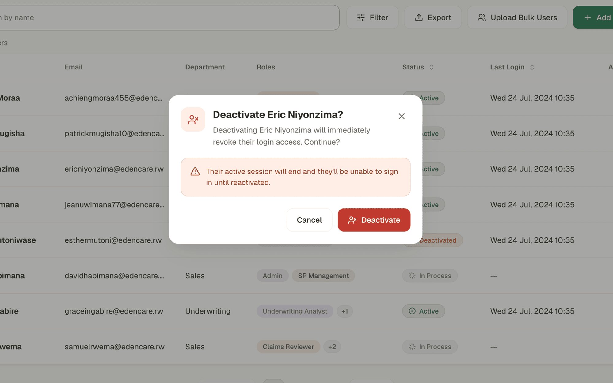
Handling edge cases and error states
Once the happy path was complete. The edge cases were visible very naturally. Various edit options like deactivating a user, re-activating a user and deleting a user were the next steps to take. Letting users know why they can't perform a certain action by giving them all the information they need.
Over- communicating was a style I followed throughout the journey of making error states and edge cases. Making sure the user does not feel confused or lost at any given point was my goal. If they can't perform an action - the why should be very clear to them
Closing beat for the act — conflicts: with four instruments in play, roles can contradict each other. Rather than a generic error, we wrote actionable microcopy: "Accountant and Account Officer have conflicting permissions. Assigning both will grant permissions for both roles." The system explains the collision and the consequence — it doesn't just refuse.



Temporary Access
Temporary access: elevation with
an expiry date
The riskiest moment in any access system is the exception. An auditor needs a week of read access. A contractor covers a claims backlog for ten days. In the old model these became permanent grants that someone was supposed to remember to remove. Nobody remembers.

Blacklist Permissions
Blacklist: a word for "no, never"
The riskiest moment in any access system is the exception. An auditor needs a week of read access. A contractor covers a claims backlog for ten days. In the old model these became permanent grants that someone was supposed to remember to remove. Nobody remembers.

5· Constrain Navigation
Honest Account of what
didn't make in V1

6· Clients using Ginja.ai
Outcomes and Insights
Old Mutual evaluated the system, tested it internally, and signed on as Ginja.ai's enterprise partner. Their team is actively using the platform today, and their feedback is shaping the next iteration.
The honest early signal: in the test environment, administrators have filed only 2–3 access-related support tickets since launch — against a previous model where every role, user, or region change was a ticket by definition. Self-service is doing what it was designed to do. This module's real-world impact is tied to how cleanly it integrates with Claims, Underwriting, and Product Configuration as they roll out; we're tracking that dependency as adoption grows.

More Projects

Pricing Engine
Enterprise SaaS
Quotation Engine
Simplified complex insurance pricing enabling brokers and underwriters to generate accurate quotes faster

Admin Platform
Role Based Permissions
Security and Access
Management
Designed the access layer for Ginja.ai . Platform for Enterprises to assign roles and govern permissions
More Projects
7· What I'll carry forward
The Learnings
Research changes the question, not just the answer. The brief we started with and the problem we ended with are not the same question. The gap between them is where the design work actually happened.
Context beats aesthetics in regulated systems. The Floating vs. Inbuilt Card decision is the cleanest example: the "prettier" choice would have introduced exactly the kind of blind spot this system exists to eliminate.
1 · The Industry Context
Setting Context
Who are the users?
The users for access management are the system admins of the heath insurance companies. Who wanted full overview of access control of their employees. The secondary users were the leaders in each department. The sales lead would need overview of the permissions their team had access to.
What is Ginja.ai ?
Ginja.ai is a SaaS platform for health insurance companies and service providers. Organisations that sit at the center of one of the most regulated data ecosystems in the world: policyholders, hospitals, third-party administrators, underwriters, and national compliance bodies.

What triggered this need ?
Insurance companies could not see what access their employees held. The Ginja.ai platform shipped with a handful of pre-configured roles like Underwriter and Senior Underwriter for underwriting portal. Reinsurer and Senior reinsurer for reinsurance module.
No visibility into what those roles actually granted
No control to customise, restrict, or expand access
No way to manage their own employee's access: every new hire, exit, or role change went back to Ginja's support team
No accountability: if something went wrong, no record of who did what and what access they had.
Why does access control matter in a health insurance platform?
A misconfigured permission isn't a minor inconvenience. In a regulated insurance environment, the wrong person accessing the wrong data means exposure to the two most sensitive categories that exist: health records and financial data. Both are legally protected. Both affect real people.
If that access is misused or breached: lawsuits, regulatory action, insurance licence cancellation. Getting access control right a security problem.
2 · Complexity
Understanding Complexity
The platform operated across multiple countries with different rules, had thousands of individual permissions to configure, and required every access decision to come with specific conditions and limits
Multiple countries, different rules
An insurance platform operating across countries can't treat access the same everywhere. Regulations, financial limits, and compliance requirements vary by region. One role doesn't mean the same thing in two different countries.

Too many permissions to manage manually
8–12 modules. 50–100 permissions each. Three access levels — View, Edit, Modify, Configure. That's close to 4,000 combinations an admin has to configure correctly. One wrong setting in a regulated platform is a serious problem.
Access needs conditions, not just a yes or no
Giving someone access isn't enough. A claims assessor can approve claims, but only up to a certain amount, only in their region. Permissions need limits attached. The question isn't just who can do what, but under what conditions

3 · What Admins Said
Research and Reframe
What admins actually needed?
We worked closely with 2 insurance companies- Eden Care Medical (our own insurance company) and Old Mutual - the PMs, and operational leads to map their real organizational structure, since there were no existing users of a system like this to research directly.
System Administrator cluster
1. No way to view, access and control roles for employees
2. No controlled process for granting temporary elevated access
3. No visibility of users being added or removed
Team Lead / Manager cluster
Cannot allocate permissions to their teammates.
2. Cannot differentiate users with similar roles but different scopes
3. No notification when access changes happen to their team
The Problem Statement
An insurance company needs complete visibility and control over what every employee can access. They need to create, modify, and revoke access and manage the full employee lifecycle: onboarding, deactivation, reactivation, deletion. The system has to be fully self-serve, at any scale, without exception. No dependencies. No workarounds. No calls to the platform team.
This is a different question than where we started. It names ownership, not features. It points directly toward the architecture that follows “How might we build a role and permission management system for health insurance organisations?”
4 · Three Layer Access Control
The Architectural Structure
Why Standard RBAC Breaks at Scale
Standard systems bundle role, permission, and context into a single object producing roles like "Claims Manager- Kenya" and "Claims Manager- Rwanda" as two entirely separate configurations. At Old Mutual's scale: 14 countries × multiple access tiers × every department - that's hundreds of near-identical roles, impossible to maintain and dangerous to audit.
One Role, Any Country: The Three-Layer Model
We separated the model into three independent layers: Role - Claims Manager. One definition, reused everywhere. Permission- view, approve, modify claims. The same token set everywhere. Scope- the conditions under which the permission applies: an amount limit, a provider tier, a department boundary, a region.
A Claims Manager in Kenya and one in Rwanda now share the exact same role and permission tokens; their local compliance and financial boundaries are isolated entirely by scope rules. Hundreds of fragmented configurations collapse into a single matrix.
Stress Test: A Role That Crosses Modules
The model also survives reality: an Underwriting Manager doesn't live in one module. They touch Underwriting, Claims for risk review, Finance for premium oversight - the same role fans out into independent permission sets, each constrained by its own scope condition. Nothing duplicated. Nothing hardcoded per country
5· One System, two Instruments
The 2 Systems
The architecture answers how access is modelled. The interface had to answer two operational questions. The same two gaps admins named in research- roles and users/ employee management. All others became a sub-function within these two.
Role Management
If a role had certain pre set scope restrictions, they will be visible while the user is being created. And while setting up organisational unit, the ones out of scope will be clearly displayed.
Selected roles remain visible throughout the form, even when you close the roles module. The user can edit/remove the roles anytime they want during the process.
Reducing cognitive load and making discovery fast by filtering roles by department and access type.
Creating a role without drowning in 300 checkboxes.
The structural fix was a split-pane system:
Modules as rows (Reinsurance, Underwriting, Sales…) admins think in their own domain, not in access theory
One consistent column pattern - Access → Modify → Configure across every module. Predictability is what reduces cognitive load at scale
Scope as a separate step - configure permissions first, then add conditional scope. Two mental models, two distinct steps
Design Decision 1
For setting scope for various permissions I explored drop downs. Depending on the permission selected, only the relevant scopes would be active to select from. I refined it further and removed the inactive scope permissions. Used progressive disclosure. As user selected certain options, relevant conditions appeared.
Design Decision 2
While working on the final UI, I had to take several design decisions along the way to best suit both the user, the business. Here's an example of one of them:
The decision- Inbuilt Scope Card
As a designer, the Floating Card feels cleaner, it protects the grid. But viewed through the lens of a security administrator, in health insurance compliance, context outweighs aesthetics.
The layout shift caused by the Inbuilt Card is a genuine UX trade-off. It’s also a necessary sacrifice. An administrator configuring a financial threshold cannot afford visual blind spots. The Inbuilt Card preserves complete peripheral vision of a user’s total access profile, preventing the exact type of overlapping privilege error this entire system exists to solve.
The Role Creation form breakdown
The Modules were aligned on the left side like chapter names and the contents within- the sub-permissions would appear on the entire screen in the centre for users to configure roles from. The modules would remain sticky to the left and the permissions would scroll and reveal more contents.
Each permission was divided in 3 permission types- access, modify and configure. All permission types, weather it was to view, edit, deactive , create, delete, approve, deny, accept, reject and many other types of permissions could easily come under these three types.
The CTA would also remain visible at all times to save a role, even when the user is browsing through hundreds of permissions.
The Real Job: Handling edge cases and error states
Working on the UI and the happy path was the easier task. Figuring out the places a user can get stuck. The places user needs to be warned and the system defined roles- that they cannot edit/ configure or delete, was the most important task for the product to work in real environments, where errors happen all the time.

User Management
If a role had certain pre set scope restrictions, they will be visible while the user is being created. And while setting up organisational unit, the ones out of scope will be clearly displayed.
Selected roles remain visible throughout the form, even when you close the roles module. The user can edit/remove the roles anytime they want during the process.
Reducing cognitive load and making discovery fast by filtering roles by department and access type.
Creating a user means three simultaneous assignments: identity, role(s), and organisational scope — which region(s) of the company's own configured structure this person belongs to. The system validates assignments against that structure, so an admin in Kenya can't quietly grant someone access in Rwanda.
While assigning roles to users means we had to make sure that users can select the roles they want even from 100s of roles that have been created. Simple search did not surfice. We needed filters like department type and access level to make them reach their required role quicker.
The Create User form breakdown
If a role had certain pre set scope restrictions, they will be visible while the user is being created. And while setting up organisational unit, the ones out of scope will be clearly displayed.
Selected roles remain visible throughout the form, even when you close the roles module. The user can edit/remove the roles anytime they want during the process.
Reducing cognitive load and making discovery fast by filtering roles by department and access type.
Handling edge cases and error states
Once the happy path was complete. The edge cases were visible very naturally. Various edit options like deactivating a user, re-activating a user and deleting a user were the next steps to take. Letting users know why they can't perform a certain action by giving them all the information they need.
Over- communicating was a style I followed throughout the journey of making error states and edge cases. Making sure the user does not feel confused or lost at any given point was my goal. If they can't perform an action - the why should be very clear to them
Closing beat for the act- conflicts: with four instruments in play, roles can contradict each other. Rather than a generic error, we wrote actionable microcopy: "Accountant and Account Officer have conflicting permissions. Assigning both will grant permissions for both roles." The system explains the collision and the consequence.

Temporary access

Every temporary grant to a selected user answers three questions at creation, and the form will not submit without them.
Who: the user receiving elevated access
What: the specific permissions granted, scoped exactly like permanent ones. Temporary does not mean broader; the same Role → Permission → Scope model applies
Until when: the expiry date. The one field that makes this system different from a normal grant
At the end date, access is revoked automatically-no ticket, no reminder, no human in the loop. The admin can delete a temporary access anytime from the user's profile.
Blacklist permissions for users
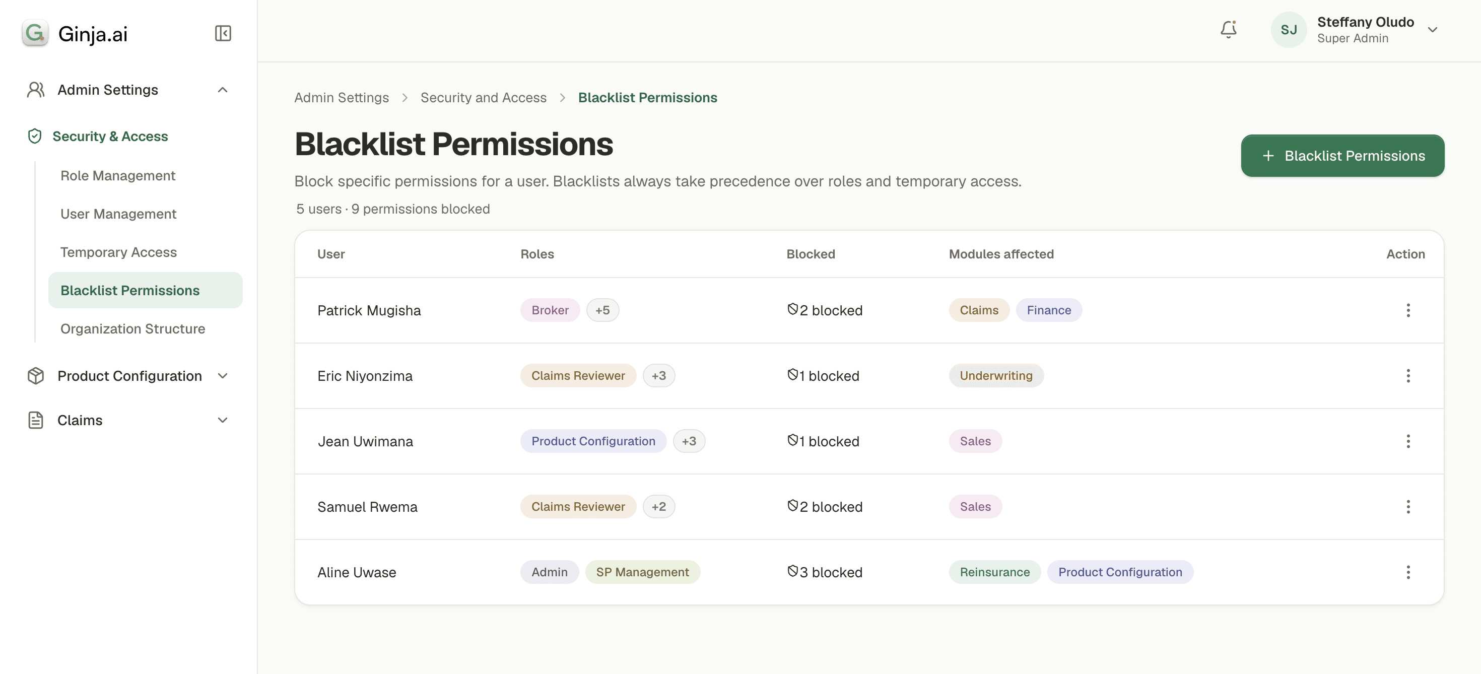
Blacklist is the answer to a question the other three systems can't ask: regardless of every role this person holds, what must they never be able to do?
Deny overrides allow. The rule is absolute and deliberately simple: a blacklisted permission wins every conflict.
Blacklist exists for the situations where restructuring roles is too slow or too blunt:
An employee under internal investigation who must keep working but must not touch financial approvals — today, not after a role redesign
A conflict of interest: a claims assessor whose relative is a policyholder, denied access to that specific member's records without changing their role for everyone else
A regulatory boundary: a permission that one country's compliance regime forbids for a role that legitimately holds it everywhere else
To add a blacklist permission to a selected user, one has to answers three questions at creation, and the form will not submit without them.
Who: the user for which permissions will be blocked
What: What are their current list of permissions and select the one you wish to block. One can even select permissions that have not been alloted to the user
Review: One final view of the permissions you are blocking and a final confirmation.
One can manage blacklist permissions by editing them. Adding or removing selected permissions.
5· Constrain Navigation
What didn't make in V1

6· Clients using Ginja.ai
Outcomes and Insights
Old Mutual evaluated the system, tested it internally, and signed on as Ginja.ai's enterprise partner. Their team is actively using the platform today, and their feedback is shaping the next iteration.
The honest early signal: in the test environment, administrators have filed only 2–3 access-related tickets while testing against a previous model where every role, user, or region change was a ticket by definition. Self-service is doing what it was designed to do. This module's real-world impact is tied to how cleanly it integrates with Claims, Underwriting, and Product Configuration as they roll out; we're tracking that dependency as adoption grows.
7· What I'll carry forward
The Learnings
Research changes the question, not just the answer. The brief we started with and the problem we ended with are not the same question. The gap between them is where the design work actually happened.
Context beats aesthetics in regulated systems. The Floating vs. Inbuilt Card decision is the cleanest example: the "prettier" choice would have introduced exactly the kind of blind spot this system exists to eliminate.
More Projects
Pricing Engine
Enterprise SaaS
Quotation Engine
Simplified complex insurance pricing enabling brokers and underwriters to generate accurate quotes faster
AI
Fintech
Real Estate
Interactive Finance Dashboards
A transactions ledger dashboard and a real estate portfolio dashboard deployed various features.
Resume