About
Think School sells live cohorts on public speaking and communication. There is no sales team and no demo. A visitor lands from a video, reads, and either enrols or leaves. The page carries the entire sale.
The site also had to introduce the company, house every course, and hand off cleanly to an external learning platform once someone paid. So the same visual system needed to work for a corporate about page and for a hard-working conversion page, without either one feeling borrowed from the other.
I worked with two other designers across the full site. This case study covers the cohort landing page and the system underneath it.
Role
Website Designer
Team
3 Designers
Colours and Fonts
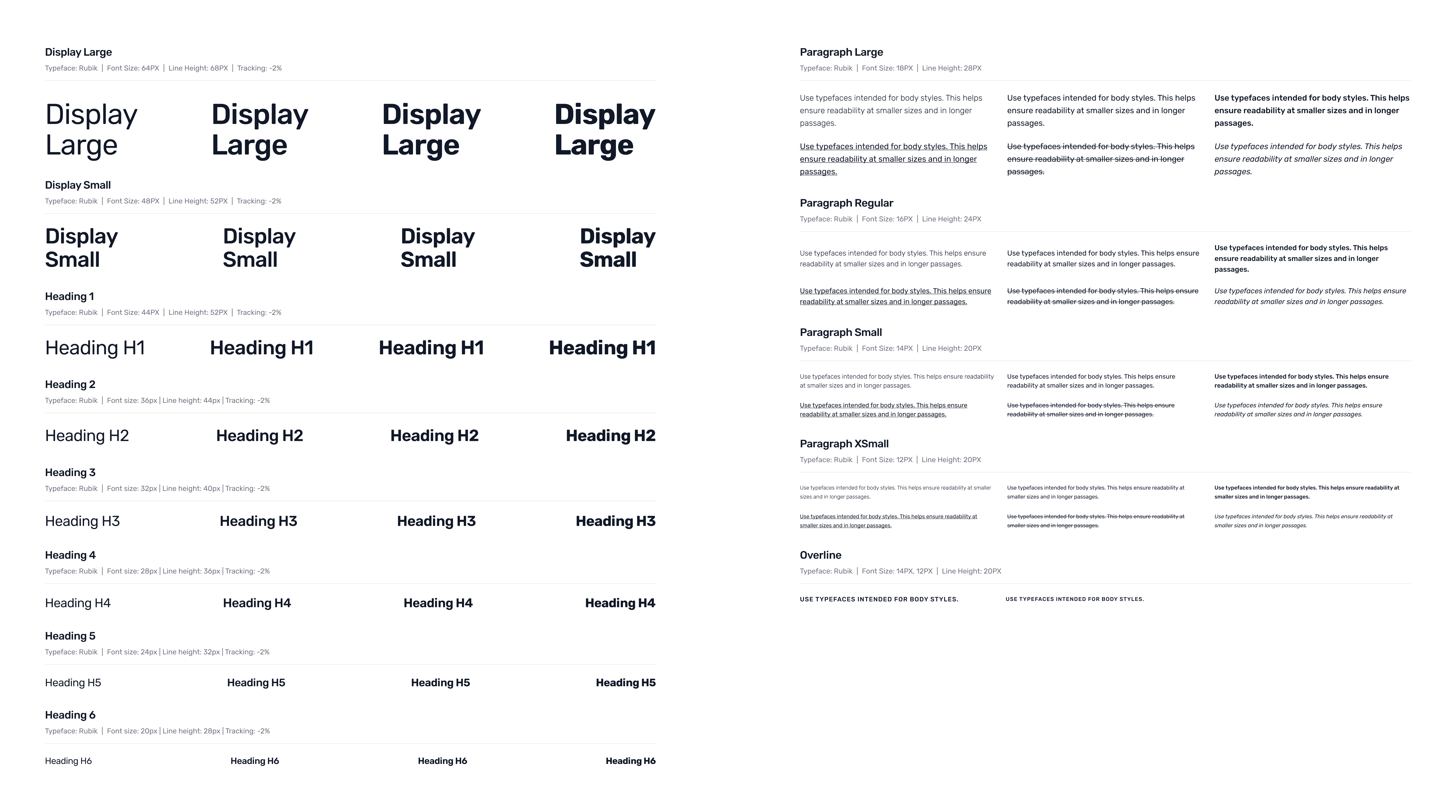
Three designers were working in parallel on a site that would keep growing, so the tokens came before the layouts. Navy through electric blue carries the trust the brand needed; orange appears almost nowhere except where a decision is being asked for. Satoshi runs across the site with separate type scales for web and mobile, so nobody had to guess a size.

Website
The full scroll, top to bottom. Every section sits where it does because of the question a visitor is holding at that exact point, and what has to be true before they keep reading. The enrolment bar stays pinned the whole way down, so the decision is never more than a glance away.