0 to 1 · Enterprise SaaS · Health Insurance
Designing the Health Insurance Quotation Engine
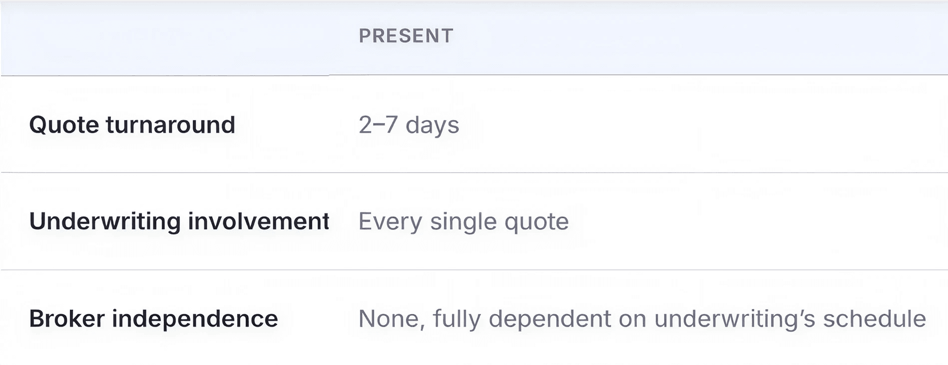
Getting a quote used to mean emailing the underwriting team and waiting 2–7 days. I designed the flow that made it self-service by putting an pricing engine on screen. So that sales agents could generate quote instantly.
Role
Product Designer
Timeline
1 Month
Team
Underwriting Head, Engineer, Me
No PM
I helped define the product

1 · Setting Context
Setting Context
The Landscape
Eden Care is a fast-growing startup providing health insurance to corporate clients. Closing a deal requires seamless collaboration between two key internal teams: the Sales Agents on the ground and the Underwriters evaluating the risk.
Sales Agents/ Brokers
They pitch to companies, gather client requirements, and negotiate terms. Their primary goal is to close deals as quickly and efficiently as possible.
Underwriters (The Risk Evaluators)
They receive the client data from Sales and analyze it to craft customized insurance quotes. Their goal is to balance competitive pricing with accurate risk assessment.
The Problem areas
Eden care is an early stage health isnurance company chasing high growth every quarter, but the quotation process was highly inefficient. Nearly 70% of the underwriting work was manual, repetitive tasks.
This created a severe bottleneck:
Delays: It took an underwriter 2 to 7 days to generate a quote both client company and underwriter agree with.
Lost Opportunities: Sales agents were left waiting, their ability to reach out to new companies slowed down because of the process of quotation was slow.
The Business Impact: In sales, time kills deals. The multi-day delay in quote generation frequently led to lost client interest. The manual process wasn't just wasting internal hours; it was actively stunting Eden Care's revenue growth and capping the true potential of the sales and underwriting teams.
The Goal- Quotation Automation Engine
Faster Quotes, Higher Sales Volume: When we give Sales Agents a self-serve tool to generate instant quotes, we remove their dependency on the Underwriting team for standard requests. This immediately frees up the Sales team's bandwidth, allowing them to spend their time prospecting and pitching to a higher volume of companies rather than waiting on internal approvals.
Underwriters to Focus on Risk: Simultaneously, Underwriters are rescued from repetitive, manual data entry. By automating the straightforward quotes, their workflow shifts to high-value risk assessment. They can dedicate their specialized skills entirely to complex, custom edge cases that actually require human judgment and evaluation.
The Problem Statement
How might we automate the standard quotation process so that Sales Agents can instantly generate quotes to close deals faster, while freeing up Underwriters to focus purely on complex risk assessment
2 · Discovery
The pricing complexity
Before designing a single screen, I spent time inside the actuarial pricing matrices. For inpatient alone: 30+ coverage rows × 10 family structures. Outpatient, maternity, optical, dental, and wellness each carry their own matrix.

Screenshots from underwriter's excel sheets. Figures shown in these screens have been altered from the real actuarial values, since that data is commercially sensitive.

3 · The decisions
Designing for Precision & Speed
Each decision below was tested with 3 of Eden Care's 5–6 active field brokers — roughly half the people who use this flow daily — across three moderated iterations.
Decision 1 — How should a broker set a benefit limit?
Every slider position maps to a row in the pricing matrix. The question was what control lets a broker land on a financially exact number fast.
Option A
Rejected
Flat form
All inputs visible at once. Looks like a
spreadsheet. Doesn't communicate which
values are valid for which context.
Option A: Flat form
Rejected. Testing showed brokers had to read and parse the pre-approved limit as text before they could even decide what to type. For one broker, this single step visibly slowed the entire flow.
Option B: Slider only
Rejected. Testing surfaced something we hadn't planned for: two of three brokers used the slider to get close to their target, then asked to type the exact number, a path the interface had no room for. The third skipped the slider entirely.
Option B
Rejected
Slider only
Brokers who know exact RWF amounts
have to drag precisely. Too imprecise for
financial inputs.
Option B
Shipped ✓
-
+
-
+
-
+
-
+
Slider with +- and input box
Brokers who know exact RWF amounts
have to drag precisely. Too imprecise for
financial inputs.
Option C: Slider + stepper + direct input.
Shipped. The hybrid the brokers were already trying to perform: slide to get close, step or type to land exactly. All three brokers reached their target fastest with this version and every position still resolves to the same actuarial sheet driving the pre-approved range.
Final UI of Option C: Slider + stepper + direct input.
Slide to get close, type to land exactly both behaviors testing surfaced, in one control.

Decision 2: Setting family composition from the Employee Census.
Family size feeds the same pricing matrix- each composition is a different row. Free-text number fields risked invalid entries and gave no sense of how composition affects price.
Steppers shipped: fast, tactile, hard to make large errors, zero stays zero until consciously changed, and the current state is always visible. The running "Total covered lives" count gives the broker one number to verify against the client's headcount.
Option A
Rejected
Number inputs in a form
Errors are invisible until submit. A broker types 500 instead of 5
and won't notice until the premium looks wrong.
Option B
Shipped ✓
Steppers — +/− controls
Fast, tactile, hard to make large errors. Zero stays zero until
consciously changed. Current state always visible.
Final UI of step 3: Configuring family size

4· The core system mechanics
The core system mechanics
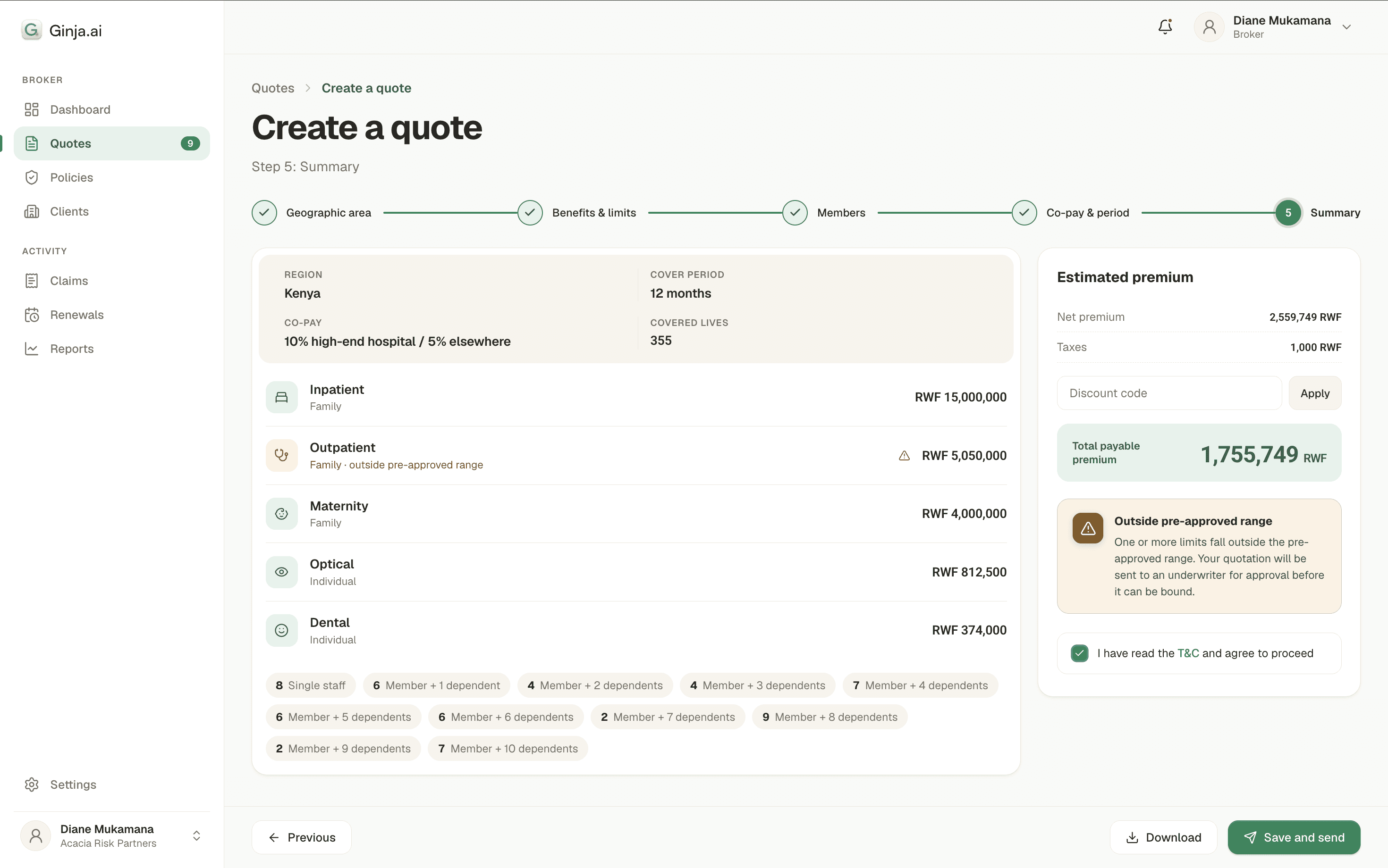
Every configuration a broker builds — benefits, limits, family composition, co-pay, period — is evaluated against the pricing matrices as a whole. By the summary step, the system has already determined which of two paths the quote belongs to:




Why there's no running premium
One feedback we received was to see a live premium ticking along as the broker configures. We deliberately didn't build it. Routing and therefore price depends on all five inputs together: a high inpatient limit can be offset by a conservative co-pay choice. Any number shown mid-flow would be a guess the system might have to walk back at the summary and a broker dispays one number at the start and another number at the end page to a client, in person, loses exactly the trust this product exists to build.
The premium appears once, when it's true.
There are only two scenarios where a user can select options that would lead to custom quotation.
When broker enters a custom limit outside of pre approved limit, a modal appears immediately: "Custom Quotation"
When "Specify own co-payment" is selected, a modal appears immediately: "Your quotation will be reviewed by our underwriter." No surprises at the end.
Always telling them at the summary page.
5· The other side
What the underwriter receives
The underwriting team's requirement was that nothing outside the approved range gets silently approved. Save and Send delivers on it: an out-of-range quote arrives in the underwriting queue with the full configuration and the specific limits that triggered review — not a raw email to reconstruct from scratch. Underwriting attention now goes only where actuarial judgment is genuinely required.


6· Outcome
Outcomes
Eden Care publicly states this on their broker page: "Get customer - ready quotes in an hour"
Within pre-approved limits the premium itself is instan- the sub-hour figure covers the full broker workflow, from client conversation to a sent quote. Both figures were confirmed directly by the underwriting head against the field broker team.
Underwriting is now involved only in configurations that genuinely require manual review, not every quote regardless of complexity.


If I could revisit v1
Saved plan templates in v1
Sales agent configure similar setups repeatedly for similar clients. Deferred to v2. Knowing that they have to configure similar inputs again for a similar client made us realise the importance of templates
Add tier types.
Employers want to give their employees health insurance based on certain categories. We got this insight when the brokers reached clients with more than 500 employees.
Digital Contracts and Payment
Because of tighter timelines- the signing of the contracts and payment between parties still happen offline.
7· What I'll carry forward
The Learnings
Letting the user know in the moment of choice was a decision that seemed incorrect and unfair. Because unless we have all the data from the user we cannot give them accurate results. We understood why the data only resolves once all five inputs are in.
Designing the solution so that users knew when the quotation is going out of set limits and might lead to custom quote.
We tested with people who would actually use our product on the field. 3 of many field brokers talked to us, and those insights drove the final design decisions.